
Consider this:
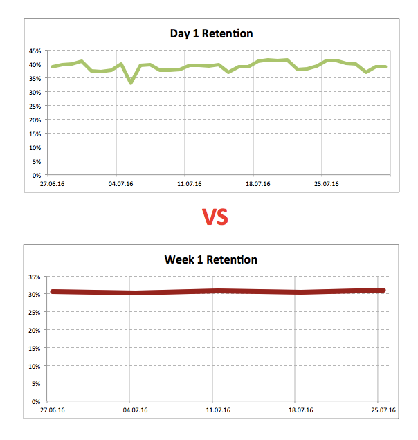
A product manager asks an analyst: “Please make a dashboard where we can see Day 1, Day 3 and Day 7 retention rates in dynamics.”
“Are you sure?” the analyst asks. “These charts will be quite noisy. Just look how much the metrics alter from day to day. Maybe it’s a better idea to monitor the weekly retention rates instead. In this case, any random fluctuations will be smoothed out. ”
They called it a deal.
Now a new dot appears on the dashboard once a week. This dot has “Everything is fine, nothing has changed” written all over it. But sometimes, the storms of everyday life are hidden behind this apparent calm: days of ups and downs, victories and defeats that happen during weekdays and weekends.
But no one on the product team finds out about them because everyone is looking at weekly metrics. Consequently, they’re missing both the random and meaningful fluctuations.
→ Test your product management and data skills with this free Growth Skills Assessment Test.
→ Learn data-driven product management in Simulator by GoPractice.
→ Learn growth and realize the maximum potential of your product in Product Growth Simulator.
→ Learn to apply generative AI to create products and automate processes in Generative AI for Product Managers – Mini Simulator.
→ Learn AI/ML through practice by completing four projects around the most common AI problems in AI/ML Simulator for Product Managers.
Why do we need dashboards?
One of the important questions that a dashboard serves to answer to product managers is “Is everything all right?” Based on the answer, there are two possible paths:
- If everything is fine, then the product manager can get back to her regular routine and carry on with her scheduled tasks.
- If some important metric has changed in a drastic way, then she must investigate it as soon as possible and come up with a plan of action.If you have a dashboard, then it’s good.
If you monitor this dashboard and use it as described earlier, then great.
To make it excellent, however, you need to change the key question that your dashboard answers.
A spike
I first heard about the concept of spikes when I was at a theatre. It was a play about David Yang, an angel investor, serial entrepreneur, and founder and Chairman of the board of ABBYY.
In one of the scenes, scientists at a university research laboratory were conducting experiments. During the experiments, the scientists looked for what they called “spikes” on graphs (a steep rise or fall on a graph).
If there was no ”spike” and everything looked predictable, then it wasn’t interesting science-wise.
If there was a “spike,” it was clear that something interesting was happening. There was a chance to make a discovery, a breakthrough. In general, everyone was looking for spikes.
Spikes and dashboards
Every day, something new happens to your products. Today, you’re going viral on mainstream media; yesterday, you changed the keywords for your app in the app store; the day before, a heavy rainfall drowned the city, or the team might have rolled out an update. Each point on your dashboard’s graphs represents the result of an experiment that the world (sometimes with your help) runs on your product.
Become a research scientist. Instead of asking the dashboard “Is everything OK?” ask “Is there a spike? Is there something I can learn from?” And at this moment, the changes that you used to interpret as mere accidents will push you to start learning new things about your product and your users.
Keep looking for “spikes.” Get to the very core of where they come from. Many of them will turn out to be happenstance and will hold nothing interesting to explore. But this doesn’t mean you should stop searching.
Some “spikes” will be caused by factors you haven’t thought of before, factors that can impact the metrics of your product. And this is exactly what you should be looking for: the levers that will help you move the product forward.
What should we look for?
Don’t only look for positive changes in your dashboard. Make sure to search for the negative ones as well. If something has ruined the metrics, then moving in the opposite direction will most likely improve them.
Investigate the reasons behind the spikes. Dig deeper. If you find a reason, but it doesn’t fully explain what is happening, then keep looking.
Perhaps you will find out that the conversion rate and overall effectiveness of ad banners increased during a competitor’s television ad campaign. So why not raise your bid or allocate some extra budget during the competitor’s campaign?
Maybe a thought leader’s post on social media has brought you traffic of a much better quality than paid ads. Perhaps it makes sense to start working more closely with thought leaders?
Or let’s say the number of app downloads has doubled in one small country. Why so? How can we replicate this success in other countries?
Yet again, maybe an accidental change in the settings of the technology underlying in product suddenly caused the key product metrics to collapse. This might mean that by improving the quality of this technology, we can improve the metrics.
None of the situations described above are hypothetical; they are true stories from my own experience. And each one of them led us to significant breakthroughs.
A case from personal experience
Let me tell you a story. A few years ago, I worked on a mobile app called Assistant. It was the most popular smart voice assistant developed by API.AI (the app is no longer available after Google acquired API.AI; it’s now called Dialogflow).
One day, we launched a sale in the Assistant app. It wasn’t anything special – we had many similar sales before. After the sales day, I opened the dashboard to check the results. Everything looked normal. I was about to close the dashboard when I noticed something unusual.
Our routine during monthly sales was to send push notifications in ten different languages to our users. Usually, conversion rates for push notifications were similar across different languages. But in this specific case, I observed a significantly higher conversion rate for the Spanish notifications.
I decided to investigate the “spike” I found and postpone other plans to some other time. It didn’t take me too long to find the potential reason for the increase in the conversion rate. It turned out that when I had edited the notification, I had only copied the first part of the message in its Spanish version. The original, English version of the notification message was, “I have a surprise for you! Here is your 50% off deal!” But the Spanish version only read, “I have a surprise for you!”
My impression was that the conversion rate would be lower in a push notification that excluded the discount context. Many companies that provide push notification services regularly stated this in their reports.
However, I didn’t find any other explanation for the spike. So we decided to experiment with this idea and don’t mention the discount in the next sale for all the languages.
As a result, purchases doubled on our next sales day. In the next update, we did the same to our regular sales, and it increased our overall revenue by 8%. This was a significant improvement, considering the fact that the app’s yearly run rate was several million dollars.
Thus, a small unexpected fluctuation in the dashboard chart that resulted from a random error gave us quite a big increase in revenue.
Note: I should say this doesn’t mean the same thing will work for your app. In the case I described, a number of product features went hand in hand to provide this missing-discount effect.
Skyeng case study
And here is an interesting case from Skyeng, a popular online school that teaches English:
Free introductory lessons are part of our sales funnel. During these lessons a teacher determines the level of the student and her goals.
One day, we noticed that one of our teacher’s conversion rate from an introductory lesson into paying student was stably higher, and we are talking about 20%, which is a lot. For a long time, we tried to figure out what was the reason. We studied all of her lessons in detail but didn’t find any explanation.
Then we noticed that while all teachers had identical topics for their students’ introductory lesson, this teacher always had different tasks and topics for the first lessons she gave. It turned out that she looked for her students’ names in advance, and was trying to get to know her students’ hobbies a little better through social networks and search engines. She discovered what sort of things they liked and then selected the topics her potential client might like.
We set up the same business process for all our new clients, and now, when a person comes to us, we already know her interests and understand what we can offer. The conversion rate of our introductory lessons have increased from 60 to 75%.
Summing it up
The manager from our story at the beginning of this article instinctively understands that he needs noisy metrics and “spikes.” These noisy metrics and spikes can reveal something valuable that you won’t be able to find otherwise.
The analyst suggests monitoring the average metrics, which on the one hand reduces the influence of randomness, but also conceals a lot of useful information.
Here’s my advice: don’t be afraid of noisy metrics. Make sure to look for “spikes” on your dashboards. Study them. Find out the reasons behind them. Do not be quick to attribute the fluctuations you find to the game of chance or seasonality.
The dashboard that says “Everything is fine” should upset you, as it doesn’t carry any information to work with. Fluctuations are your chance for discoveries and breakthroughs.
What discoveries did you make? What did you learn from “spikes” on the product’s graphs? Share your experience with us in the comments!
→ Test your product management and data skills with this free Growth Skills Assessment Test.
→ Learn data-driven product management in Simulator by GoPractice.
→ Learn growth and realize the maximum potential of your product in Product Growth Simulator.
→ Learn to apply generative AI to create products and automate processes in Generative AI for Product Managers – Mini Simulator.
→ Learn AI/ML through practice by completing four projects around the most common AI problems in AI/ML Simulator for Product Managers.