
When I worked at Facebook, the Workplace analytics team had a cool tradition: The team’s weekly meetings always started with a small data quiz.
The winner of the previous week’s competition would prepare a question about the product’s key metrics. For example, “what was last month’s MAU?” or “how many new users joined last week?” or “what proportion of the new companies reach 10 users?” or “what was last month’s revenue?” The question had one requirement: Its answer had to be found on the team’s dashboard.
The participants were to write down the answer without getting help from computers, which meant we could only use our memory to do so. The person whose answer was closest to the correct number got +1 point in the chart, and the person who was the farthest lost 1 point. Every six months, a winner was chosen and the game started again.
I participated in five seasons and won three of them. In one of the final rounds, I was tied with another analyst. The team arranged the final round, where we had to answer five questions in a blitz quiz. I managed to score the winning point and won the mug that you see in the photo below.
I told this story not because I wanted to brag about winning the quiz (well, this too, to be honest). In almost every quiz, the respondents’ guesses on metrics were distributed across a wide range, which I found surprising.
Why? Well, first of all, it was the analysts who played the game. They were the people who worked with data most of their time and should have been good at navigating it. Second, these analysts were working at Facebook, a company that has a very advanced and strong data culture. At Facebook, each team has clear goals, dashboards are available to all the company’s employees, and all meetings start with progress updates on key metrics. How could these people be so wrong in answering questions about the product they were working on?
If you decide to play this game with your company’s employees, you will most likely be as surprised as I was. It will turn out that most people have very vague ideas about the key metrics of your product and business. And some people will have no idea at all.
In this essay, we will discuss why it is important for team members to remember at least approximate values of the key product metrics, why this usually doesn’t happen, and how to get there.
→ Test your product management and data skills with this free Growth Skills Assessment Test.
→ Learn data-driven product management in Simulator by GoPractice.
→ Learn growth and realize the maximum potential of your product in Product Growth Simulator.
→ Learn to apply generative AI to create products and automate processes in Generative AI for Product Managers – Mini Simulator.
→ Learn AI/ML through practice by completing four projects around the most common AI problems in AI/ML Simulator for Product Managers.

Why it’s important to keep the key metrics in mind
Every day, different team members make many small decisions that affect the product. The effectiveness of their decisions largely depends on how close their perception of the product is to the reality, as well as how effectively they use this knowledge in the decision-making process.
You might ask, why would I need to know product metrics by heart? I can always look at the dashboard, write a SQL query, or ask an analyst to help me. In theory, you can. But in practice, people rarely interrupt a meeting or a discussion to go and get the data, especially if the decision doesn’t look too risky or life-changing. In such meetings that lack facts and data, factors such as persuasiveness, authority, and charisma start to take the lead.
On a certain team scale, a lack of key metrics knowledge doesn’t really affect the product team performance. The team leader can still control a significant part of the projects, adjust priorities and key decisions if necessary. But when the company reaches a certain size, the leader has a much narrower range of tools: She can define the main priorities, design the process and motivate the team. Most decisions, however, will be made locally. And in this situation, the quality of such decisions and the effectiveness of the entire system will greatly depend on team members having the right understanding of the product and the world around them.
We have a very poor idea of the world around us
In his book Factfulness: Ten Reasons We’re Wrong About The World – And Why Things Are Better Than You Think, Hans Rosling illustrates how far our ideas about the world are from reality. Rosling shares the results of the research he made while travelling around the world and giving lectures. This research touches upon different groups of people he interviewed during this trip. He began each of his lectures with a series of questions about the world that surrounds us, simple test questions with multiple-choice answers.
For example, “In all low-income countries today, how many girls finish primary school?”, Or “Where does the majority of the world population live (in poor, middle or rich income countries)?” or “What happened to the proportion of people living in extreme poverty in the world over the past 20 years?” or “What is the average life expectancy in the world today?” or “What will be the population of the planet by 2100 according to UN forecasts?”
Very few people get the correct answers to the above and other similar questions. What is especially interesting is that the proportion is even worse than it would have been if people had answered questions randomly.
Another interesting fact is that the proportion of correct answers doesn’t really correlate with the respondents’ education level or their achievements. The results of such surveys among heads of state and executives of the largest businesses in the world look very similar to those of university students.
For example, the chart below shows all the countries of the world. The X axis is the average number of children born per woman, the Y axis is the percent of children who made it to their fifth birthday.
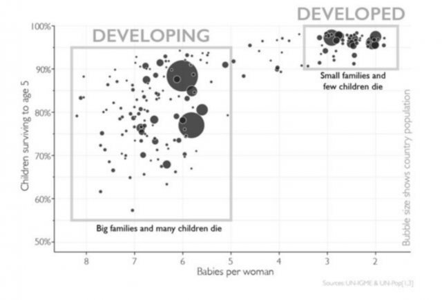
You can clearly distinguish two groups of countries divided by an enormous gap:
- Developed countries (mainly in the West) with a good level of healthcare and a high level of education. In such countries, the infant mortality rate is low, as is the average number of children per family (1-3).
- Developing countries (countries of the African continent immediately come to mind) with a low level of education and poor healthcare. They are characterized by high infant mortality rates and a large average number of children in the family (5-8).
This graph reflects the views of a significant part of the population in developed countries about the worldview. I can at least attest that my own perception of the world was pretty much the same.
The problem is that the above graph shows the situation of the world in 1965. This is what the world looked like 55 years ago!
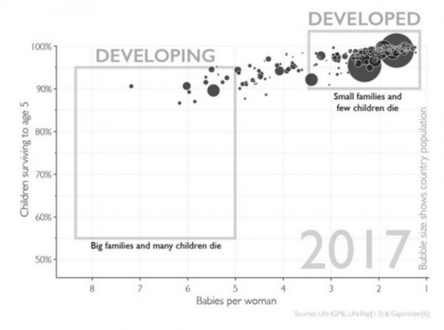
If you look at the current situation, then there is no longer a gap between the developed and developing countries. Instead, there is more of a gradient. Moreover, a huge proportion of countries that were previously in the developing box have transitioned to the developed countries box in the graph below.
The gap between people’s ideas about the world and reality is as wide as the gap between your team members’ ideas about the product they are working on and the real situation.
Hans Rosling gives various reasons that explain the observed distortions in people’s perceptions of the world: a tendency to simplify, categorize and generalize; characteristics of human perception; the specifics of the way mass media and press work (the disproportionate amount of attention given to problems, sharp and provocative topics), the outdated information in a rapidly changing world, and so much more.
(By the way, I recommend reading the book Factfulness: Ten Reasons We’re Wrong About The World – And Why Things Are Better Than You Think” There are many interesting examples, and it gives a good idea about the world we live in, and about where it is heading toward.)
How to bring product team ideas closer to reality
I am not sure whether or not there is a complete solution to this problem. And to be honest, a complete solution may not be necessary. To have a creative process, it’s necessary to have people with different mindsets work at your company and examine different views and prospects for products, their value and their growth. But if you still want to bring the team’s views closer to reality, then the following steps might help.
Make the key product metrics available to everyone
The availability of information on the key product metrics implies that all team members have access to the data, that all product teams have updated and well structured dashboards, that there are tools in place to work with data, and that the team members know how to use them.
For example, when I worked at Facebook, any employee of the company could look at the dashboard of any team at any time. This dashboard clearly reflected the key metrics, their dynamics, and most importantly, the goals that the team is aiming for.
Another aspect of data accessibility is the ability of team members to quickly access data when they need it. If people must wait two days for the answer to a simple question because the analytics team is too busy, then they will naturally begin to decide based on their own intuition. It is difficult to postpone a decision on a specific issue for two days if it blocks the product development pipeline or any other important process.
At Facebook, managers in the analytics department tried to clearly communicate to analysts and data scientists that they are not data querying interfaces. If it turns out that small ad-hoc tasks take more than 15% of an analyst work time, then this is a problem that needs to be addressed at a more structural and systemic level.
By the time I left Facebook, the Workplace team I was working with had grown several times. With the growth and influx of new people, the number of simple data questions to the analytics team inevitably increased. When the volume of these questions became significant, someone took over the initiative and conducted a SQL Bootcamp. After several meetings, the newcomers learned how data was stored, how they could make simple data queries or where they could find query templates. Some of my colleagues even built special tools and dashboards that made it easy to get answers to the most popular questions, and sent the link when asked relevant questions.
Create processes that turn information into knowledge
Consider dashboards, tools, and training people as a foundation. Unfortunately, the availability of data doesn’t automatically transform into knowledge in the minds of team members. One way to turn the available information into knowledge is to create special processes.
Below I will share what, from my point of view, worked well at Facebook.
All the team’s regular meetings started with a quick update on the goals and metrics. Given that all team members were usually strongly motivated to achieve the goal, this format incited keen interest and worked well.
When I share this example in my conversation, I often hear that updating the metrics every week doesn’t make sense, because key metrics usually do not change fundamentally within a single week. But the point of this process is not to track changes in metrics, but to remind people once again where we stand, where we are headed, and what we aim to achieve. This is a way of turning information into knowledge.
At Workplace, the unexpected fluctuations in metrics, the launches, the product changes, and the experiments were studied and the results were shared with the whole team. For example there was a special Workplace group where each new experiment came with a description, the initial hypothesis, and the target metrics. In the same thread, people shared the results and conclusions from all the past experiments. A culture of documenting knowledge allows you to accumulate and structure important information over time. Such a knowledge base is a great asset that helps you easily find the information you need, and also allows new team members to quickly gain expertise in the product and improve its understanding.
At Facebook, we also had regular weekly meetings to discuss experiment results. At these meetings, everyone who had ongoing experiments shared the results using a standard presentation template, followed by a discussion with representatives of the growth team, analysts and PMs.
These meetings and discussions exist on a meta level and affect all other processes. It is important to create an effective culture of discussing various issues in a team where hypotheses and facts are clearly separated from each other. If someone makes a statement or a proposal, then it must be supported by data or the results of a research. If this is not the case and the person presents her hypothesis as a fact, then it is important to be able to take note and clearly point it out.
These are just a few examples that worked at Facebook. All companies are different and, for sure, you will need to adapt the above processes or come up with new ones that are tailored for your team and company and integrate your data into decision-making processes.
Summing it up
Are you still doubting that your colleagues know the key factors of the product they are working on? Just try playing this game with them: Prepare 10 questions about the key metrics of your product or company, ask everyone to answer them with their computers turned off, and draw the answers distribution.
After that, you can keep playing this game with the team from time to time. This will serve to solve two problems at once:
- This is a good way to measure how close your team’s ideas about the product and business are to the reality, and what is the dynamics of your team in respect to this matter.
- It also helps motivate people to check dashboards with the key metrics (at least from time to time).