
It is common to evaluate your product performance and the impact of changes you make by using engagement metrics with active audience in the denominator. Examples of these metrics include the time spent per active user, the occurrence of certain actions (messages sent, levels played, chapters read, etc) per active user, or ratio metrics (what percent of active users perform a specific action) .
In most situations, these engagement metrics will be helpful. But in some cases, they can be misleading. And it is important to understand why and when this can happen, and what you can do about it.
→ Test your product management and data skills with this free Growth Skills Assessment Test.
→ Learn data-driven product management in Simulator by GoPractice.
→ Learn growth and realize the maximum potential of your product in Product Growth Simulator.
→ Learn to apply generative AI to create products and automate processes in Generative AI for Product Managers – Mini Simulator.
→ Learn AI/ML through practice by completing four projects around the most common AI problems in AI/ML Simulator for Product Managers.
Example: How time spent per active user can be misleading
“Time spent per active user” is a widely used metric that helps you understand how engaged your audience is. To measure it, we add up the time spent in the app by all users over a certain period and divide the sum by the number of active users in the same period (total time spent by all users / number of users). You can measure this metric with daily, weekly or monthly granularity.
Social media app companies regularly use this metric to evaluate user engagement. For example, Facebook users spend an average of 58 minutes per day on the platform, Instagram comes second at 53 minutes, and YouTube at 40 minutes per day. [source] Time spent per active user gives you a rough idea of which apps have the most engaged users. Another good example is how YouTube considered the television as one of its main competitors and used time spent watching YouTube vs time spent watching TV as a way to measure its progress.
Now here’s where the widely used time spent metric can fail you. Imagine you are working on a mobile product and your team has chosen to focus on growing time spent per active user.
One day you release an update with a big change aimed at increasing user engagement, so you expect it to increase time spent per active user. Fortunately, the App Store likes that change and decides to feature your app. So on the day you roll out the update, you enjoy a huge influx of new users.
The following day, you check the dashboard and see that time spent per active user has gone up. The team is happy – the investment made in the update has paid off. But over the next month, the increase in time spent per user goes away and the metric returns to its previous level. What happened? Was it novelty effect? Or maybe something else?
This is a theoretical case, but let me show you another scenario where the product change had no impact on the product’s performance, and the increase in time spent per active user metric happened due to a different reason.
Imagine the product you are working on has the following dynamics:
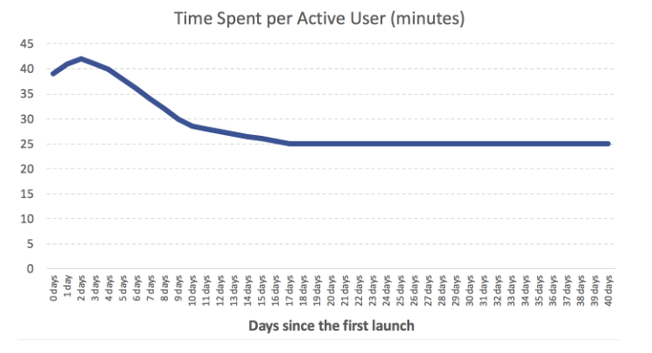
- Users spend more time in the product in their first days, mainly because they are exploring its features. In the following weeks, their time spent in the app reduces considerably.
- Behavior in the product varies across users who have been using the product for different periods of time.
As long as the number and structure of daily active users of the product you work on is stable, the time spent per active user metric describes user engagement quite well. If you improve your product and make it more engaging, this metric will reflect it.
But at times where you see a sudden spike in the number of new users (or another factor changes the structure of daily active audience), the very same metric that worked well before can become misleading.
Since new users tend to spend more time in the app in the first few days, you will see an increase in time spent per active user even if the product has not changed.
Real case from personal experience
Here is a real case from my personal experience. When I was part of the Engagement team working on Workplace by Facebook, at some point we were focused on growing time spent and content production. To evaluate our work, we chose the following metrics: “time spent per weekly active user” and “content production per weekly active user” (work tools have a weekly rhythm of usage and therefore it makes sense to use weekly granularity).
Over the next few months we learned about the many ways these metrics could be affected not only by product changes but also by lots of other different factors. Here is just one example: If a big company with low engagement started using Workplace, then overall engagement metrics would go down. The opposite would happen if the company was highly engaged.
Usually, you expect metrics to help you navigate your product world and understand what’s happening. In this case, the increase or decrease of the time spent per active user metric was ambiguous and could mean many things.
We spent a lot of time investigating the reasons of the sudden changes of the metric. In the end, we changed our approach to measuring engagement because using time spent per active user and content production per active user did not help align the team and caused more confusion than clarity.
Example: How feature engagement metrics can lead to wrong conclusions when you improve retention
Here’s another example.
Imagine you are working on a mobile product that has feature X. This feature is super relevant to old users (those who spent 30 days and more in the product). But new users employ it rarely during the first 30 days after their first launch. But their usage of feature X grows afterwards.
At some point the team makes an update and introduces a new feature Y that is used a lot by new users who joined the product just recently. This feature significantly improves short-term retention but has a smaller effect on long-term retention, hence the usage of feature X remains at the same level (because people use it mostly after day 30 and the experience of users at this period of their lifetime in the app was not affected).
After the release of the new version of the product, the following happens:
- The team that developed feature Y is super happy. They quickly see high adoption rates and improved short-term retention.
- With higher short-term retention and the same number of new users, the app’s active audience starts growing.
- But the number of users of feature X remain almost the same. As a result, the percentage of active audience who use feature X drops.
The team working on feature X is puzzled. They did not make any significant changes to feature X, the product’s short term retention improved, but feature X usage and adoption has taken a nosedive.
The team will probably conclude that the update had a serious negative impact on feature X, but that would be wrong. They simply improved short-term retention.
What is wrong with engagement metrics that have active users in the denominator?
All the examples we just examined have one common trait: They use metrics that have an active audience in the denominator.
An active audience is a mix of people who have spent different amounts of time using the product. It can include new users, people who have been using the app for several days, as well as “veterans,” users who have been with the product for a long time.
And at different times, the mix of users of different age in the active audience varies.
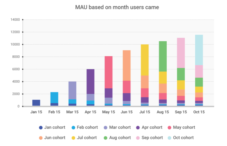
Let’s consider the following app which was launched in January:
In January, the app’s MAU was almost entirely composed of new users. But by October, new users accounted for less than 50% of the active audience. Therefore, the active audience composition varied greatly from month to month.
Since the behavior of new users differs from that of veterans, when we see changes in either of these categories in terms of their share of the app’s active audience, any metrics that have an active audience in the denominator with also change.
You can also look at the daily audience from a different perspective. It can comprise of users from different countries, platforms, traffic sources, etc. User engagement usually varies across different segments. Therefore when the mix of these segments in active audience changes, you will also observe changes in metrics that have an active audience in the denominator.
How to measure the impact of changes on user engagement: experiments and cohort analysis
The best way to measure the impact of product changes on engagement metrics is through experiments (A/B tests).
When conducting an experiment, you randomly split the users into control and test groups. The control group continues to use the current version of the product while the test group receives the modified version (e.g., containing a new feature). With the groups being equal in everything except the version of the product, the only thing that can explain the difference in their behavior and the metrics that measure that behavior is the change you made in the product.
Say you’re examining a modification to a feature with the help of an experiment. You can easily compare the percentage of users in each test group who use feature after the change was made to evaluate its effectiveness. The same method is applicable to high-level engagement metrics like time spent per user or number of times a user opens an app.
However, not every company has the necessary infrastructure and/or the inhouse expertise to run experiments while avoiding mistakes and misconceptions in the process. If your company has all that, then I would definitely recommend conducting experiments to measure the impact of almost all major changes you make.
For example, at Facebook, almost every new feature is launched through experiment, However, the company has made huge investments into education and infrastructure that allows engineers to launch experiments easily.
On the continuous iteration of the platform, Facebook CEO Mark Zuckerberg says, “At any given point in time, there isn’t just one version of Facebook running, there are probably 10,000. Any engineer at the company can decide they want to test something. There are some rules on sensitive things but in general an engineer can test something.”
Another approach to measuring the engagement of your product, which solves the problems discussed above, is cohort analysis. The idea of using cohort analysis for measuring engagement is simple: You assemble two cohorts of new users who experienced different versions of your product and compare their metrics. This approach is similar to experimenting, but you do not split users randomly into groups – you choose groups of new users that came in different periods of time and consequently experienced different versions of the product.
Cohort analysis does not depend much on the infrastructure and expertise you need to run experiments and is more easily accessible. But measuring engagement using cohort analysis also has its downsides. You have to put effort into controlling for the fact that cohorts have identical characteristics, which is not easy and, to be honest, not always possible. You should also keep in mind the potential impact of seasonal and other factors, which is not always easy to do.
Does it make sense to use metrics with the active audience as the denominator?
Yes, it does. But be careful.
We discussed how the structure of the daily audience can change. So keep in mind that changes in these metrics might relate to both the product and the structure of the active audience.
In some cases, the use of metrics with an active audience in the denominator will help you quickly understand how changes to the product have affected users. This is especially true if these changes involve product features that users employ long after they start using an app. In this case, waiting for new users to reach this stage of product use takes a very long time, and it makes sense to factor in metrics with an active audience in the denominator. This allows you to quickly learn about the impact of any change. However, you should be very careful when drawing conclusions based on such metrics.
One of the ways to minimize the negative effects is, for example, to use the cohort of users who joined the product more than six months ago. This cohort will most likely be stable and won’t be subject to significant changes in terms of mix of daily audience. By filtering to only examine these users, you remove most of the possible problems and can evaluate changes to metrics with more confidence.