
A metric is a way to measure anything and express it as a number. In a product or business, metrics are a key guide for assessing a company’s activities and outcomes.
The very notion of “metrics” inevitably raises many questions: why they are needed, how to choose them, how to calculate, track and interpret them.
This guide is for beginners in product or business metrics. It explores the concepts essential for working with data correctly.
Contents
- Metrics: definition
- Why product metrics are needed
- How to work with metrics
- What questions metrics answer
- Types of metrics: product, growth, added value and task‑efficiency metrics
- Typical tools and methods for working with metrics
- Learn more (additional reading)
Metrics: definition
A metric is a measurable indicator used to track a specific parameter over time and to assess a result at a particular moment. Metrics exist everywhere, both in the real and digital worlds. Examples include air temperature, blood sugar level, GDP per capita, a company’s annual revenue and the number of website visitors per day.
Metrics do not exist by themselves; people create them to measure phenomena around them. A good metric therefore always has a clear, practical meaning. If a metric’s meaning is unclear, it is useless. For example, the archaic French ‘lieue’ fell out of use because standard kilometers were more practical.
Any rational business relies on metrics. In IT and digital companies these typically include:
🔸 Product metrics—e.g., how often users return to the product (retention).
🔸 Business metrics—e.g., sales volume or number of client requests.
🔸 Marketing metrics—e.g., the ratio of clicks to impressions for an advertising campaign (click‑through rate, CTR).
🔸 Production and technology metrics—e.g., web page load speed.
🔸 And many others.
This guide focuses on product metrics: metrics that most often appear in product work and are practically significant. We also include some metrics from adjacent areas (business, marketing, technology), because products do not exist in a vacuum and are tightly connected to the rest of the business.
Why product metrics are needed
Product metrics are a window into the current state of the product. Product teams use them to decide what to change, how important those changes are and which ones to prioritize. Metrics help teams to:
1️⃣ Understand what is happening with the product, the business built around it and its customers.
2️⃣ Make informed decisions about changes in the product.
3️⃣ Evaluate impact: Determine if changes improved the user experience.
4️⃣ Measure factors closely related to the product and influencing it, for example targeted advertising, partner publications and referral programmes.
5️⃣ Detect anomalies and respond to them quickly.
6️⃣ Present results succinctly to stakeholders.
How to work with metrics
A product manager’s primary goal is to create value in the product for users and thereby transform that value into profit for the business. Metrics are the most important tool for making data‑driven decisions through which this goal is realized.
Products are complex ecosystems. Professional analysis requires more than just chasing numbers; it demands a deep understanding of the context behind them:
- the processes behind the numbers;
- the tasks users come to the product to solve;
- the stage of development the product is at;
- benchmarks in the industry;
- many other aspects.
While there is no universal formula for metrics, mastering these principles will allow you to measure almost any product or business process, either directly or through correlations.
What questions do metrics answer
Below are several examples of common high‑level metrics and the questions they answer.
- Revenue—How much money did our product receive over a given period before deducting costs?
- DAU/WAU/MAU (Daily/Weekly/Monthly Active Users)—How many active users does our product have daily, weekly or monthly?
- Retention—How does the product bring users back? For most product types this is one of the key indicators. Retention shows what percentage of people returned on day N (week N, month N) after their first entry into the product and is measured as a percentage. Retention can also be calculated for the use of specific functionality within the product. More details can be found in the guide to retention.
- ARPU (Average Revenue per User)—How much money does the average user bring in over a given period? It is calculated by dividing total revenue by the number of users.
- LTV (Lifetime Value)—How much money will one user bring to the product on average over their entire lifetime with the product? This is an important indicator for forecasting the product’s revenue and profit.
The metrics above are common and widely used, but they may not meet all the needs of the product team. In that case, the team can create metrics to measure a specific process particular to the product—the main thing is that the team clearly understands what and why they are counting.
For example, Duolingo invented iWAURR (inactive WAU reactivation rate) to solve a specific retention problem. This metric represented the share of users who:
- were not active today;
- had been active in the previous six days;
- were successfully brought back to the product today.
Metrics can answer any product question, provided you define the calculation to yield actionable insight.
Types of metrics: product, growth, added‑value and task‑efficiency metrics
In GoPractice’s educational products we divide metrics into four categories:
- Product metrics
- Growth metrics
- Added‑value metrics
- Task‑efficiency metrics
This taxonomy is not formal but is popular in the product community because it makes it easier to understand the nature of metrics and learn principles for working with them.
Product and growth metrics
Product metrics show how the product turns new users into other outcomes: active users, paying users, profit, orders, support requests. These include the retention and LTV metrics mentioned above, as well as user conversions such as to a purchase.
Growth metrics reflect the effectiveness of the business built around the product. They can be the number of active users (DAU/MAU), gross profit, number of orders, number of videos viewed on a platform, and so on.
💡 Growth metrics are literally the product metric multiplied by the number of new users.
| Product metric | New users * product metric | Growth metric |
| Daily Retention | New users * Daily Retention | DAU (Daily Active Users) |
| LTV | New users * LTV | Gross Profit |
| Retention into sending a message | New users * Retention into sending a message | Number of users who send messages |
| Percentage of new users who subscribe | New users * percentage of new users who subscribe | Number of new subscribers |
It is important to understand the difference between these two types of metrics.
Since growth metrics are obtained by multiplying a product metric by the number of new users, such metrics are easy to inflate. Suppose we are working on a mobile game with low monthly retention (3%) for its category, meaning only 3 of every 100 players will play next month. If we buy advertising and attract a large number of new users, we will see a spike on the MAU graph. However, because our product does not retain users well, this may not be economically viable: the retained players will not generate enough revenue to cover the costs of acquisition. For more on the nuances of working with retention, read our detailed guide.
This does not mean that growth metrics are useless or always manipulative—the example above merely emphasizes that it is important to understand all the components of a metric and not look at it in isolation from other factors and indicators.
Therefore, if we want to measure the success of changes in the product we should pay attention to product metrics. If retention increases then over time it will mean we can keep more users in the product than before, which in turn will increase business effectiveness and be reflected in growth metrics.
Task‑efficiency and added‑value metrics
We also single out two other categories of metrics that help manage the product at the level of the value it provides to users.
Task‑efficiency metrics measure how much effort and resources are required for a user to solve their task or to achieve a certain degree of progress in solving it.
Added‑value metrics measure how much more effectively one product solves a task than another (i.e., the difference in the efficiency metrics of two products).
A simple example: suppose there are two financial products designed to generate passive income from money invested in them. The only difference between them is their annual interest rate:
- Product 1 yields 5% per annum.
- Product 2 yields 7% per annum.
In this case the interest rate is the task‑efficiency metric for each product. The difference between the rates (2 percentage points) is the added‑value metric of product 2 relative to product 1.
If you want to learn more about task‑efficiency and added‑value metrics we recommend this article.
Typical tools and methods for working with metrics
What is a dashboard
A dashboard is a visual display of different metrics. A simple example is a car’s instrument panel, which shows speed, fuel level, mileage, cabin temperature and so on.
Dashboards streamline access to key metrics on a given topic—that is, to quickly assess the product’s current state and compare it with recent figures. As a result, different teams in a company usually configure their own dashboards for convenience and dynamic monitoring. In your role at a new company or product there are probably already similar dashboards you can study.
Every major analytics system provides dashboards that can be customised for their user (e.g., product manager). We discuss analytics systems themselves in more detail below.
Metric trees or metric hierarchies
Every product is characterised by a set of different metrics, and all of them directly or indirectly influence one another. This gives rise to the concept of a metric tree. Although we do not use this concept in GoPractice simulators and materials, it is common in the product community, so it is worth a brief explanation.
A metric tree visualizes how different metrics in a product influence one another, from high‑ to low‑level metrics.For instance, the concept of revenue in any business consists of many factors. For an e‑commerce product this might include number of orders, price of goods, average order value, average number of purchases per user per month, return rate and so on. Decomposing the metric “revenue” allows you to build a metric tree.
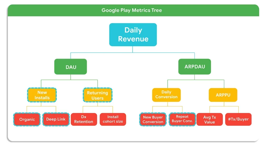
The main value of the metric tree is discovering the levers that affect your high-level metric. This helps different teams avoid tracking metrics in isolation and instead contribute to goals within a common “tree” while understanding how metrics affect one another. For example, when it becomes clear that increasing the average number of purchases will increase revenue, hypotheses arise about how to achieve this. The tree also helps align different teams or even departments who may be working on one large product.
That is why many product and business consultants often rely on the metric‑tree concept in their programmes. It is a clear way to decompose the entire structure of a product, which can help you identify and highlight problem areas (although it does not tell you how to solve the problems found).
North Star Metric, proxy metrics, leading metrics and vanity metrics
Beyond standard metric tracking, the following four concepts define how professionals analyze product health.
North Star Metric (NSM) is the key metric of a product’s success that all teams’ efforts are directed at improving. The NSM is derived from other metrics that reflect the product’s effectiveness in its different parts and is the apex of the metric tree.
The NSM serves two purposes:
- First, it unites the product team’s efforts around a single goal that reflects the product’s value. Aligning team efforts around the NSM is necessary for focused and consistent product work.
- Second, the NSM helps to evaluate and prioritize new projects. It acts as a benchmark when determining how those projects will affect the product’s growth.
We discuss the NSM in more detail and how to choose it for your product here.
We use proxy metrics when the thing we care about (like ‘Trust’) is impossible to measure directly. Suppose we cannot accurately measure user satisfaction with the product (or cannot fully trust the results of a survey). Instead, we can choose a proxy metric that correlates with increasing or decreasing satisfaction, such as how much time users spend in the product or how often they invite friends.
Leading metrics forecast changes in the main metric that we care about. For example, website traffic is a leading metric for the number of new registrations, and customer satisfaction (NPS) predicts churn or growth in the number of customers.
Vanity metrics have no practical meaning for product work but look impressive. They might include page views, number of app downloads or even the total number of product users. You have to be particularly careful with vanity metrics: they can easily misrepresent reality and lead the product team down the wrong path. Unscrupulous managers may use such metrics to demonstrate their effectiveness, even though they create no real value for the product. Consider an example from our Data‑Driven Product Management Simulator.
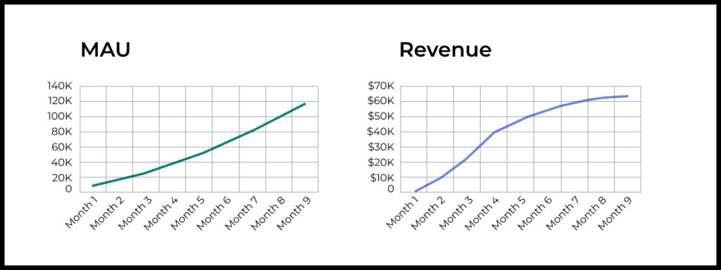
A cautionary tale
Company Y developed a new product. After a soft launch it showed decent results:
- The cost of acquiring a user was $1.
- The average revenue from one new user was $2 over the next four months after acquisition.
- 30% of new users continued using the product after a month (and the share gradually decreased to 15%).
The team decided to launch the product worldwide. A marketing team was hired and did a good job: keeping acquisition cost at $1, they brought in 10,000 new users in the first month after launch, 15,000 in the second, 20,000 in the third and so on.
An experienced product manager was also hired to develop the service. Unfortunately, he turned out to be a bad product manager. He released a new version of the product each month, but the changes he made were unsuccessful. Therefore, after each change, revenue from a new user dropped by $0.10 and the share of users continuing to use the product in the long term decreased by 2 percentage points.
Historically, the company tracked monthly active users (MAU) and revenue for each product. They set MAU goals and measured the team’s success based on these metrics. So at the end of the year, nine months after the global launch, management was very pleased with the results. Remember, our product manager was making the product worse every month! But growth metrics kept rising steadily.
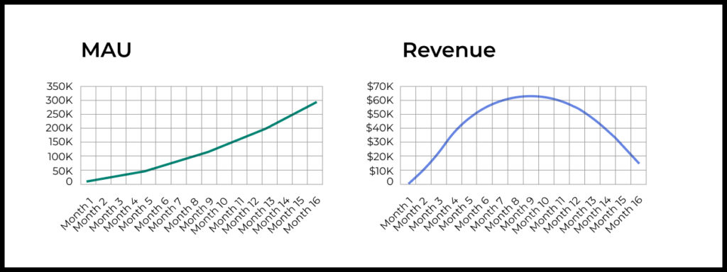
Below are the same graphs but with data for 16 months after the product launch. Here the consequences of unsuccessful changes are already visible. But the first signals appeared only 10 months later! At the same time, the audience continued to grow rapidly.
Remember: there are no universally “good” North Star, proxy or vanity metrics. Depending on the product and the goal the team wants to solve with the metric, any metric may serve these roles.
Frameworks for working with metrics
There are various frameworks that provide a systematic approach. They translate stages of user interaction with the product into measurable metrics. We can’t cover all of them in one article, but to get a feel of the landscape, let’s discuss two popular ones: AAARRR (the “Pirate metrics”) and HEART.
AAARRR
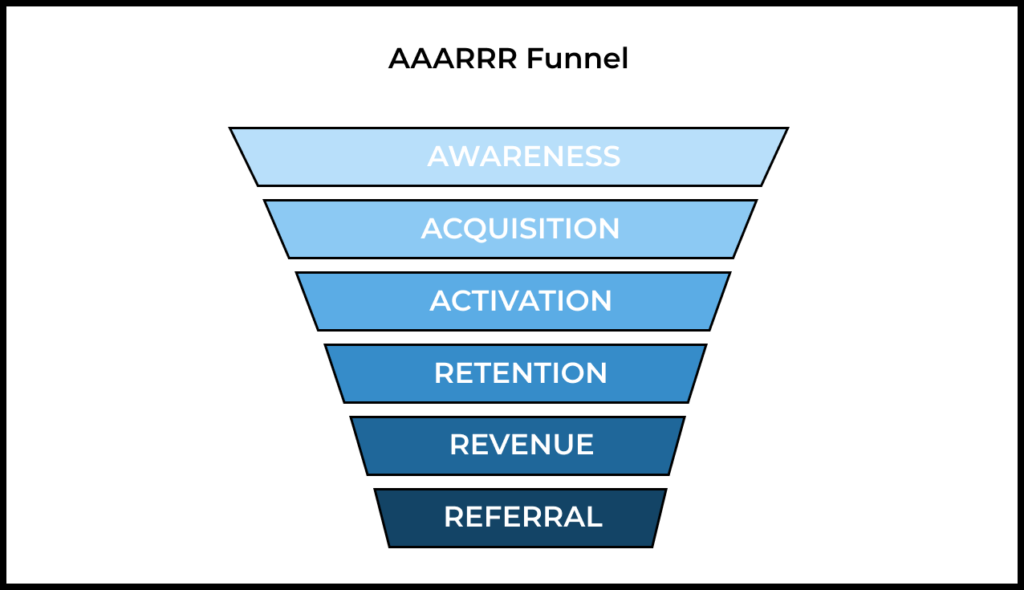
The“pirate” framework is an acronym from the names of the main stages of interaction with the product.
- Awareness—how people learn about your product and how brand awareness changes. It can be measured through search queries, media and social‑media mentions.
- Acquisition—how people come to the product. It can be measured through product traffic, traffic sources and cost per acquisition (CPA).
- Activation—how people realize the value of the product. It can be measured through completion of onboarding (the share of users who complete the process), performance of key actions, purchase of a subscription and so on.
- Retention—how users return to the product. It can be measured through the retention metric itself: retention to open the product, retention for a specific action, retention to purchase, etc.
- Revenue—how the product is monetized and how much it earns. It can be measured through total revenue over a certain period, average revenue per user (ARPU) and LTV.
- Referral—how users invite others to the product. It can be measured through the share of users who share a link to the product, the share of users activated after following a referral link and so on.
It is important to determine which of your product’s metrics you will track within this framework, set KPIs or OKRs for them and then formulate hypotheses that could improve the chosen metrics.
HEART
This framework allows you to map key user actions in your product to specific measurable metrics. The abbreviation stands for:
- Happiness—user satisfaction.
- Engagement—the level of involvement.
- Adoption—how many users started using the product.
- Retention—returning users.
- Task success—success in completing tasks.
The framework requires defining three key aspects for each component: goals, signals that indicate achievement of the goal and metrics that measure it. Here is what it looks like in a table:
| Goals | Signals | Metrics | |
| Happiness | Improve user satisfaction | Positive reviews, brand loyalty | NPS, app‑store rating, support tickets |
| Engagement | Increase depth of use | Frequency and duration of use | Sessions per user, time spent |
| Adoption | Encourage initial uptake | Use of specific features or purchases | Share of users performing the action |
| Retention | Keep users coming back | Repeat visits or actions | Retention rate over time |
| Task success | Help users complete tasks easily | Completion of key tasks | Share of users completing tasks |
For example, for the Happiness category we want to measure user satisfaction. Signals might include positive feedback and brand loyalty. Specific metrics could be Net Promoter Score (NPS), rating in the app store, the number of complaint tickets to the support team, and so on.
To measure Adoption, the signals may be use of a specific feature or making a purchase within the product. The metrics, accordingly, can be the share of the total number of users who performed this action.
What’s the difference?
Typically the AAARRR framework is used for products focused on growth, marketing and revenue optimization. It is most relevant for start‑ups in the growth stage.
The HEART framework is suitable for products focused on UX optimisation and is relevant for mature products.
How to discover, track and analyse metrics? Analytics tools
For each group of metrics that may be relevant in product work there are specific tools to study them. Here are some examples:
- Website metrics: Google Analytics.
- Application metrics: Amplitude, Mixpanel.
- App marketing metrics: Adjust, AppsFlyer.
- SEO metrics: Google Search Console, SEMrush, Ahrefs.
- Email marketing metrics: SendPulse.
- A/B testing: Optimizely, VWO.
The list above is not exhaustive: there are other types of metrics and corresponding tools to track them.
If product usage data is stored in the product’s own relational database, you can retrieve it using SQL queries. This is a much more flexible way to measure the metrics you are interested in, but it requires specialized skills (which you can gain in our SQL Simulator for Product Analytics). This method is suitable for products with many platforms (web, mobile, IoT), for corporate products in a closed environment and when security requirements prevent data from leaving the company’s servers. In that case, you can build reports and dashboards in BI tools such as Power BI, Tableau, Metabase and others.
On the other hand, ready‑made tools like the abovementioned usually provide convenient ways to visualize data and customizable dashboards that let you see all important metrics on one screen.
If you are starting work on an established product, it is likely that all the necessary analytics tools have already been set up. In this case it is important to study the specifics of the tools in use (including their documentation) and talk to colleagues in the product team to understand them better.
When working with popular tools you should also remember that the same metric names in different tools may hide slightly different definitions. That is why it is important to study the documentation of each tool.
Learn more
In this section we have collected useful links to help you delve deeper into metrics and product work.
About metrics
- Product metrics, growth metrics, and added value metrics—a detailed guide to metric types and the roles they play.
- How to Measure Anything: Finding the Value of Intangibles in Business by Douglas W. Hubbard. The author debunks the myth that some things in business cannot be measured and explains with examples how to do it so that decisions are more informed.
- Retention: how to understand, calculate and improve it.
- Guide to ARPU: formula, calculation example, LTV vs. ARPU.
- How to calculate customer Lifetime Value: the do’s and don’ts of LTV calculation.
About product work
- We recommend reading our Product Management Fundamentals series of materials. You can start with this article.
- We mentioned SQL in the context of working with analytics tools. You can begin learning it here.
Comprehensive training on metrics
To learn how to work with metrics and make data‑driven decisions, you may be interested in the Data‑Driven Product Management Simulator.
Illustration by Anna Golde for GoPractice